Splash image of updated pages

Careers Site Redesign

Designing to support major hiring growth and improving the applicant experience.

This case study outlines how I balanced the demands of a growing business with user-centered design. As the only UX designer on the project, I collaborated closely with research, product management, HR, and development to create a smoother, more intuitive applicant journey from start to finish.

Discovery

THE PROBLEM

The existing site had several critical issues:

  • Poor mobile experience

  • Important information hidden behind carousels and modals

  • Accessibility issues and outdated look.

GOALS

  • Increase applications by improving clarity and flow.

  • Design mobile-first based on real user behavior.

  • Improve SEO through cleaner structure and readable content.

  • Modernize visuals and align with brand direction.

  • Build reusable components for future scalability.

Image of UX Research summary page

USER RESEARCH

I collaborated closely with our UX researcher, who ran discovery interviews and synthesized insights. The key findings include:

  • Most applicants use mobile at some point in their journey, confirming a mobile-first design is essential.

  • Applicants felt lost, unable to find relevant information.

  • The site’s layout felt inauthentic and corporate, not useful to the applicant.

Content Strategy

CONTENT OWNERSHIP

HR owned all copy and imagery, which created cross-departmental decision-making challenges. I navigated content disagreements by:

  • Using research and analytics to back up decisions.

  • Relying on UX heuristics and accessibility standards as objective guardrails.

  • Presenting multiple layout options, enabling HR to decide while maintaining good UX.

KEY IMPROVEMENTS

  • Rebuilding the global navigation to group pages more intuitively.

  • Eliminated hidden content (carousels, modals) and made critical information readily available.

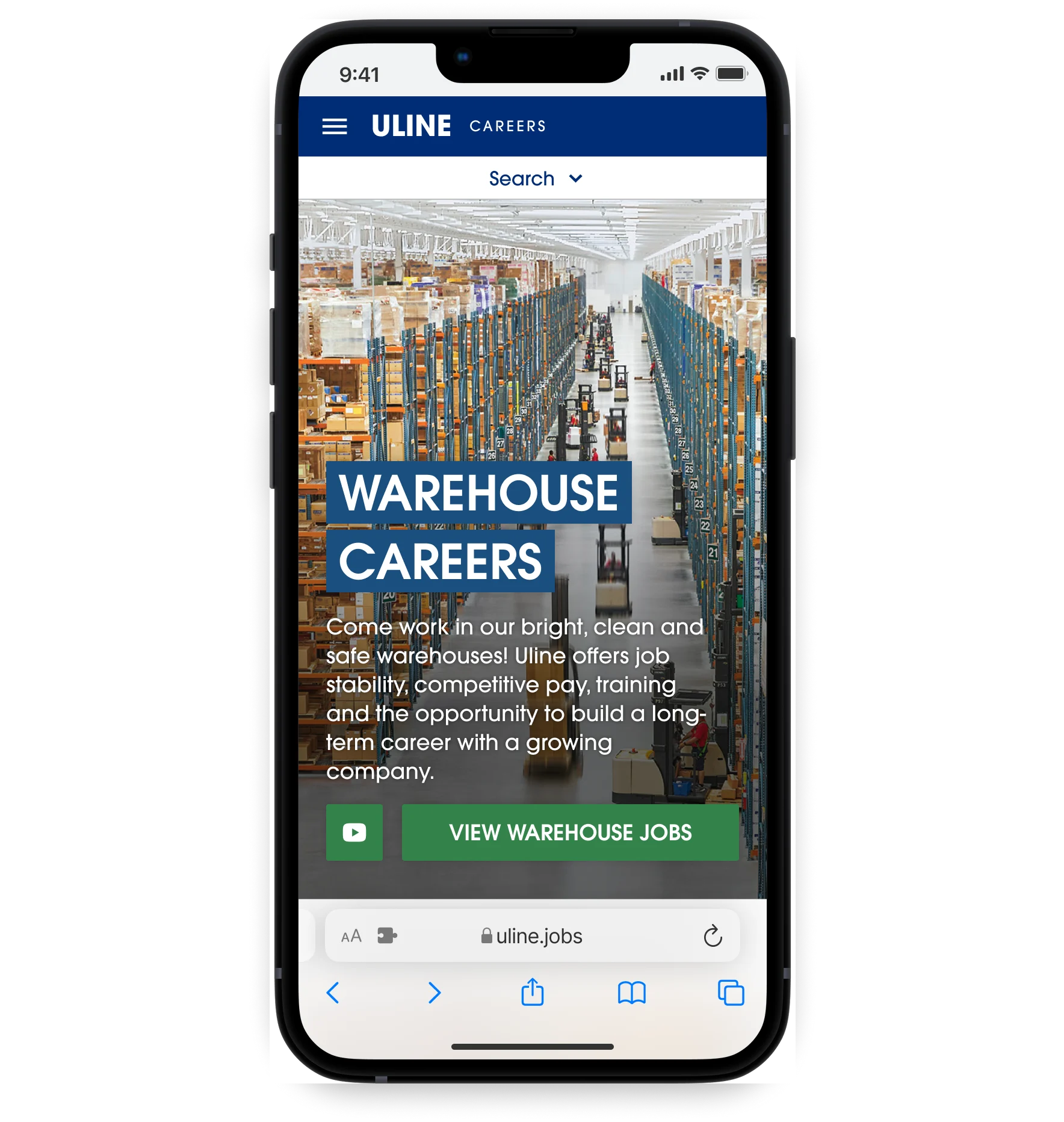
  • Designed vertical layouts optimized for mobile reading.

  • Standardized templates so HR had a consistent framework for future projects.

Design

THE PROCESS

I created mobile wireframes first, shared them with HR for content updates, then refined the final UI for consistency and polish.

Because our dev resources were limited, I designed solutions that were both impactful and feasible, implementing updates page-by-page.

Mobile mockups of multiple pages
Before & After showing a more engaging page design

A TURNING POINT

At one stage, I realized I was mostly designing to avoid upsetting stakeholders. The result was functional, but I received feedback that the design didn't encourage them to scroll down the page. So I decided to push for a more dynamic visual approach while still respecting content priorities.

The reaction was immediate: one stakeholder responded with a genuine “WOW!” This became the direction we moved forward with, helping align teams around a more engaging, applicant-friendly experience

Impact

Mobile display of the updated Warehouse page

OUTCOMES

The updated designs were met with strong internal support and immediate positive feedback from recruiters and HR. While full analytics will come post-launch, early outcomes include:

  • Clearer content hierarchy across 20+ pages.

  • A significantly more usable mobile experience.

  • A modern, consistent visual system that supports brand alignment.

  • A base component library to scale future web work.

I’m most proud of the cohesive look and feel I established, and the beginnings of a design system that will keep the site consistent and scalable long-term.

Conclusion

WHAT I LEARNED

This project was a complex, multi-department effort that required diplomacy, structure, and thoughtful design leadership. It taught me how to navigate large organizations, advocate for users with evidence, and create solutions that balance vision with real-world constraints.

The final result is a careers site designed for clarity, exploration, and real applicant needs. It will serve as a foundation that can support Uline’s hiring strategy for years to come.

Desktop display of the updated Warehouse page
BACK TO HOME