Building a Design System
How I led the effort creating a design system for an internal sales tool from scratch.
How I led the effort creating a design system for an internal sales tool from scratch.
The company’s internal sales tool had grown over time without a design system or shared UI guidelines. As a result:
Core components like buttons, inputs, and modals did not match across the product.
Designers and developers wasted time reinventing components.
Modernization was a priority, but we lacked a scalable foundation.
Standardize the UI across the sales tool.
Improve accessibility with WCAG-compliant color and component guidelines.
Modernize the visual look and interaction patterns.
Provide a future-state vision for a more cohesive, scalable product experience.
Increase design and development efficiency, especially during handoff.
My team began by reviewing 50+ screens, modals, and flows in the existing product. This helped identify inconsistencies across the app.
I presented the audit to key decision makers across the company, showing the necessity to build a design system.
I used the audit to find commonly used elements with the most inconsistencies and started there.
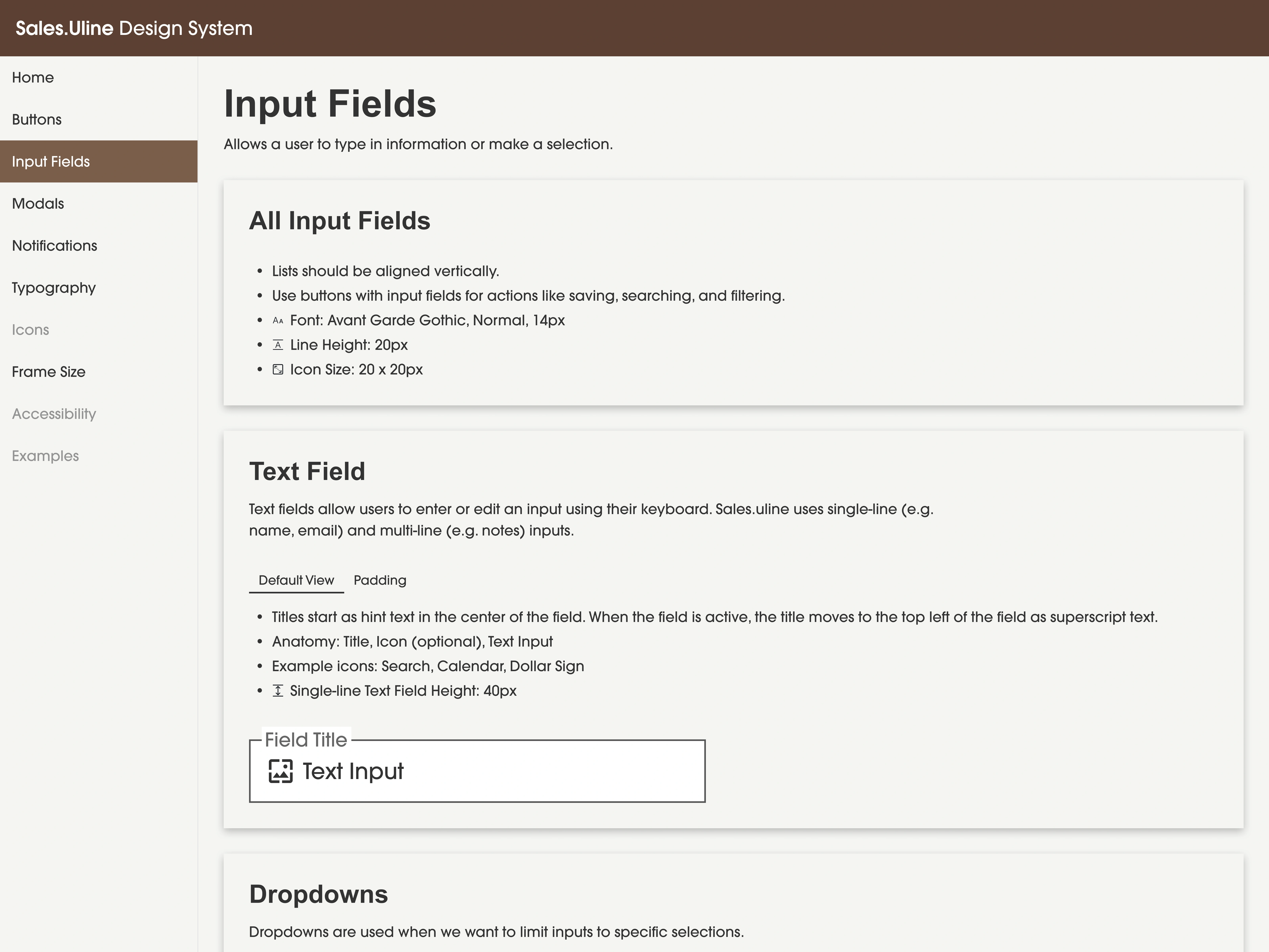
Using atomic design principles, I designed each component with clarity, modularity, and accessibility in mind. I started with:
Buttons (Primary, Secondary, Tertiary, and Destructive).
Modals (3 versions to account for different use cases).
Inputs (Text fields, Checkboxes, Radio Buttons and Errors).
Each component included documentation covering usage, states, content guidelines, and edge cases.
I created a structured Figma library so designers and developers could reuse components efficiently. Documentation pages included:
When and how to use each component.
Behavior and interaction patterns.
Accessibility requirements.
Each component included documentation covering usage, states, content guidelines, edge cases, accessibility notes, and developer expectations.
Leaders across the company prioritize finishing projects as a metric for success. Spending time building internal documentation was considered inefficient and unnecessary.
I demonstrated the current state issues of the app and convinced leaders this would prevent inconsistencies in the future.
I adopted a new process, creating future state design components while completing projects. This allowed me to continue meeting company metrics while slowing building out the system.
Much of the product’s front end relied on dated UI patterns. Full-scale adoption wasn’t immediately possible.
I met with developers to understand their process and identify how the system could be implemented.
They worked project-by-project as well, slowly developing future state elements and allowing me to add the code to my documentation.
Eliminated accessibility issues based on WCAG-compliant color compliance and guidelines.
Future designs will be built using a consistent structure and reusable components.
Clearer documentation and reusable components have made handoffs smoother.
We're looking into applying this system to different applications and across different teams.
The design process has become more efficient by using common components and tokens across multiple projects.
Cross-functional can use this as a common language, improving communication.
Creating a design system taught me how to think systematically, creating components that solve immediate problems and scale to support future use cases. Working through atomic design principles and collaborating closely with developers showed me how good systems get built and adopted.
Now that teams are actually using it, I'm focused on building out more advanced components and putting some governance in place so the system can grow without falling apart. The foundation is solid, and the next step is making sure it scales thoughtfully and becomes a cental part of how we build.